Color isn’t an afterthought—it’s a strategic design decision that shapes how people feel, think, and heal. In healthcare spaces, where environments can influence everything from anxiety to trust, color becomes a subtle but essential part of care.
At Interplan, we understand that a healing environment goes beyond equipment and lighting—it’s built through design choices that support both the body and mind. Color is one of those choices, and its impact is often felt before anything else.
How Color Impacts Healing
Before choosing specific colors, it’s important to understand their impact. Color influences how we perceive our surroundings and can have significant psychological and physiological effects, particularly in high-stress environments such as hospitals, clinics, and therapy spaces. When used with intention, it can reinforce a sense of calm, offer visual clarity, and enhance the experience for both patients and caregivers.
Color Categories to Support Wellness
With a basic understanding of color’s influence, the next step is choosing hues that support the emotional goals of a space. Below are common color categories used in healthcare environments and the feelings they’re designed to evoke:
Calming and soothing: Ideal for patient rooms, recovery areas, and counseling spaces
· Soft Blues: Reduce anxiety and promote tranquility
· Greens: Suggest renewal and connection to nature
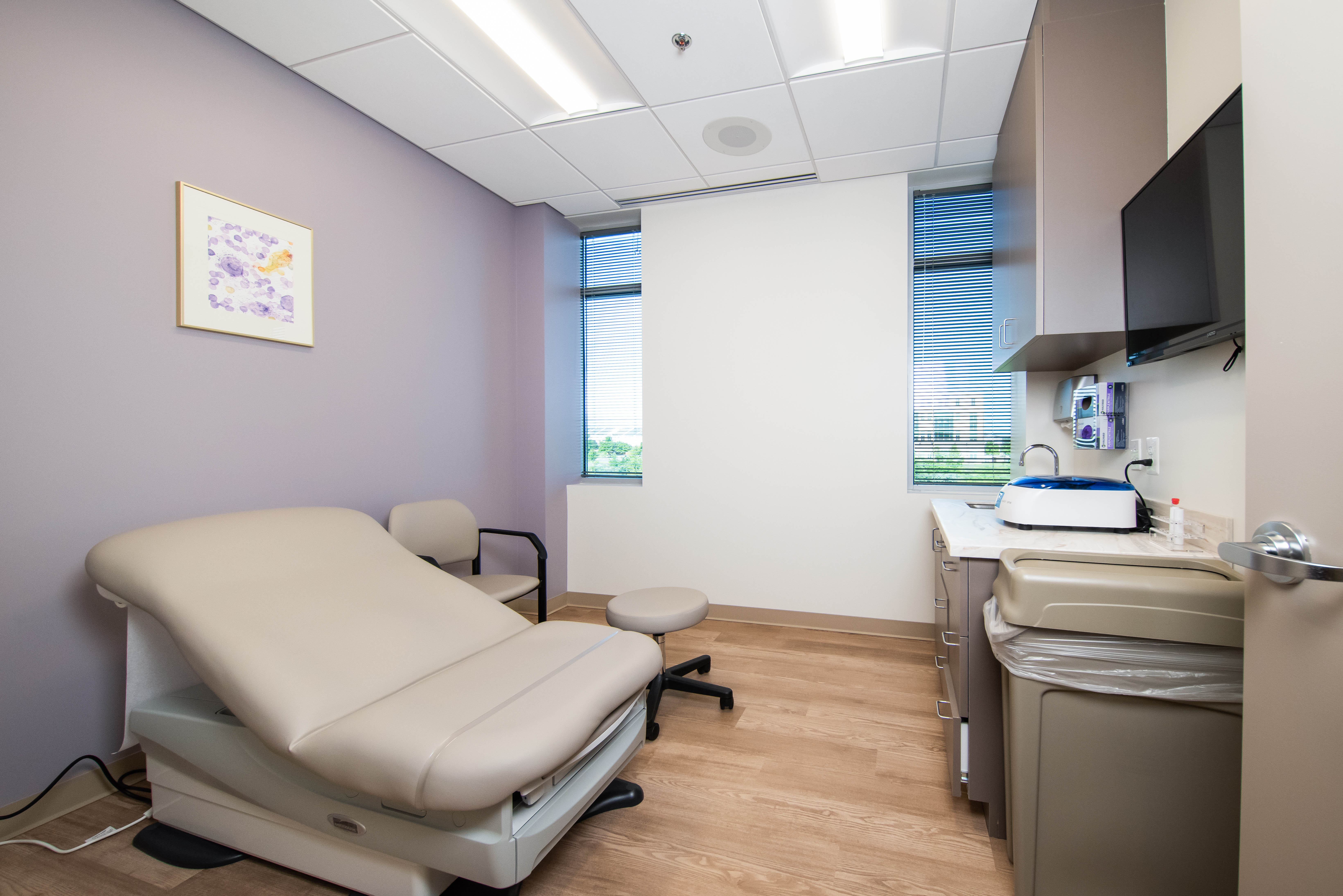
· Lavenders & Mauves: Soothe and support restfulness
Energizing and uplifting: Used in active zones such as physical therapy areas, exam rooms, or staff workspaces where energy and alertness are needed
· Yellow: Boosts mood, optimism, and energy
· Orange: Encourages warmth and engagement
Comforting Neutrals: Offer visual balance and warmth throughout a facility
· White: Makes spaces appear larger, brighter, and cleaner, but should be used in moderation
· Beiges: Provides a sense of stability, comfort, and neutrality
· Grays: Creates serenity and a sense of calmness and professionalism
· Earthy Tones: Provides a grounding effect and promote a sense of stability and security
Colors to Use with Caution
Just as the right colors can enhance a healing environment,others, when used excessively or in the wrong context, can have the opposite effect. These colors should be used in moderation:
· Saturated Reds and Bright Yellows: Can increase heart rate and anxiety levels
· All-White Environments: May feel sterile, cold, and impersonal
· Overuse of Bold or Dark Colors: Can create visual clutter or make small spaces feel confined and heavy
.jpg)
Matching Color to Room Function
Emotional impact isn’t the only factor to consider—function matters too. The same color can feel different depending on how it’s used and who it’s meant to serve. Here’s how to tailor your palette to the needs of each room:
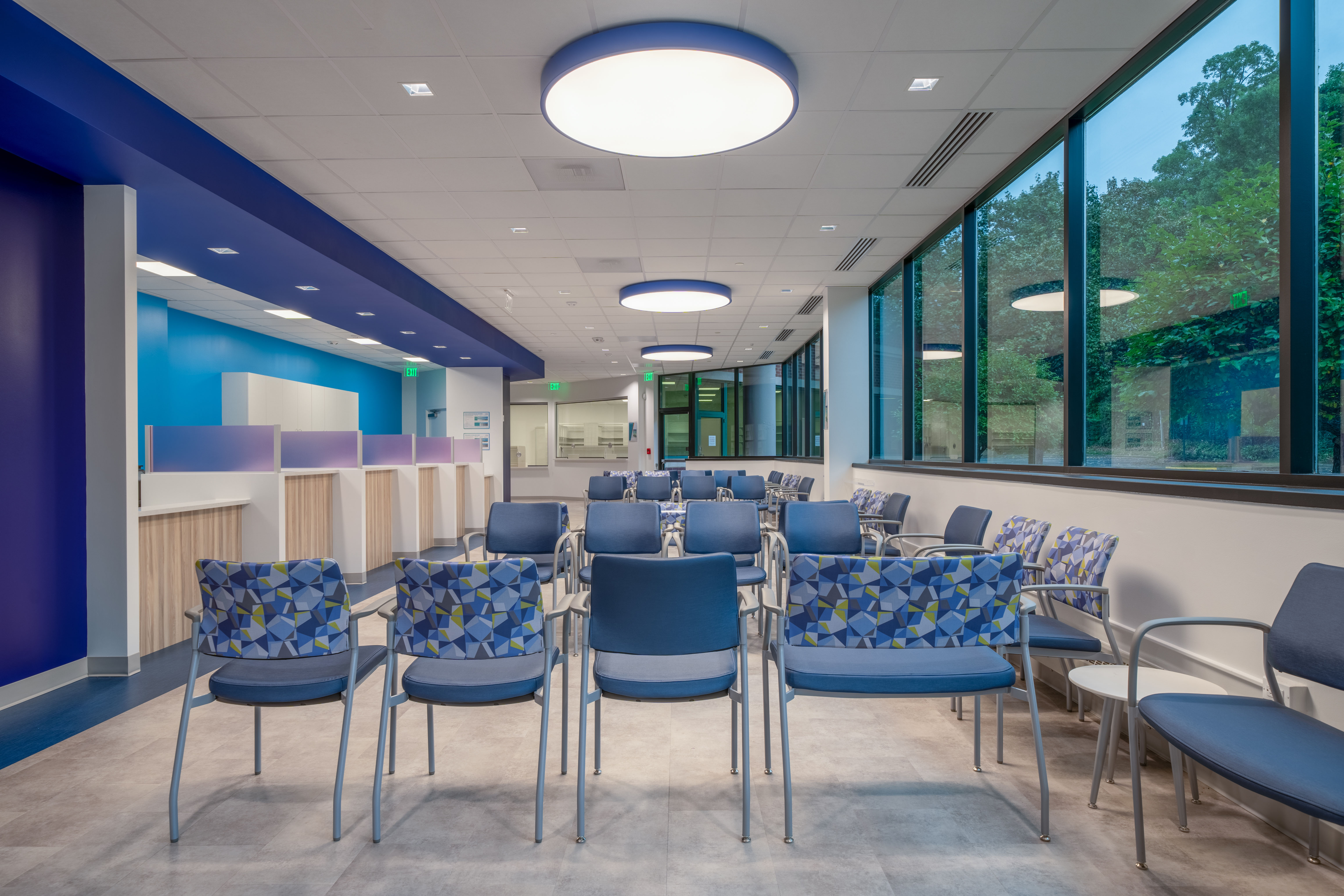
Patient rooms: Use soft blues, greens, or neutrals to create a tranquil, comfortable environment
Waiting areas: Choose calming, welcoming tones like warm neutrals and earth tones to reduce stress
Treatment rooms: Align the color with the type of care—use energizing hues in physical therapy spaces, and softer shades in counseling or diagnostics
Surgical and recovery areas: Pale blues, greens, and lavender help reduce tension and promote healing
Pediatric areas: Children respond well to bright, cheerful colors; pastels create a playful, non-threatening atmosphere
Staff areas: Cool grays or muted colors help maintain focus; small doses of yellow can energize without overstimulating
Breakrooms: Use warm neutrals or soft greens to create a restorative escape for healthcare staff
Color is one of the most accessible and powerful tools in healthcare design. When used thoughtfully, it can calm, energize, clarify, and comfort—all without saying a word. At Interplan, we believe healing begins the moment someone enters a space. That’s why we design with intention, using color not just to decorate, but to support the wellbeing of everyone who walks through the door.
In our next post, we’ll explore how to use color with greater intention, thinking beyond walls to how it shapes experience and flow.