In our previous post, we explored how color influences how people feel, think, and heal, especially in healthcare environments where stress levels are high and comfort is critical. But selecting the right color isn’t just about choosing calming blues or energizing yellows. It’s also about applying those choices in a way that aligns with the function, flow, and users of a space. Moving from instinct to intention means understanding how color interacts with every aspect of the environment—from layout and lighting to the needs of the people it serves.
Balance Is Key
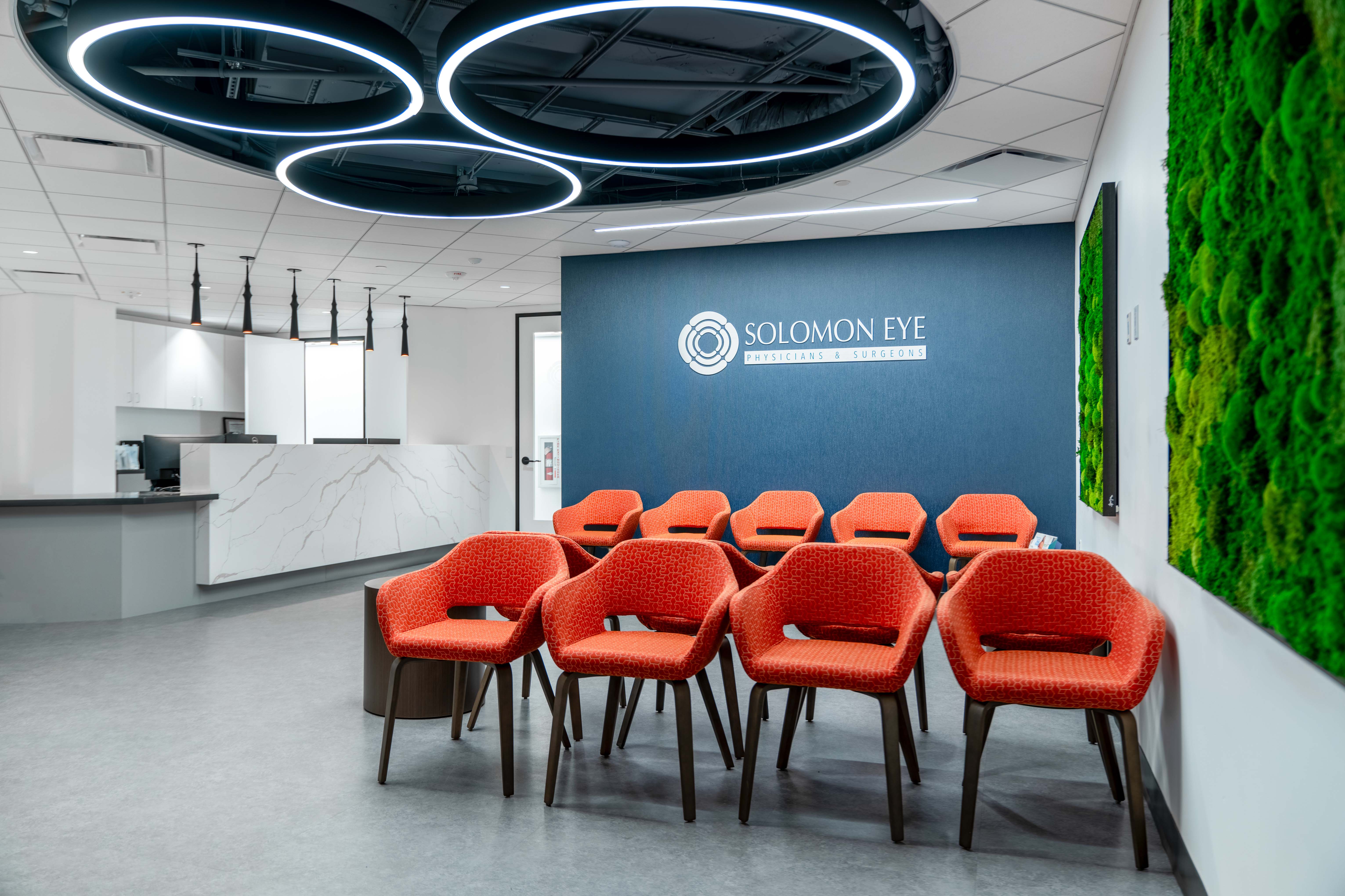
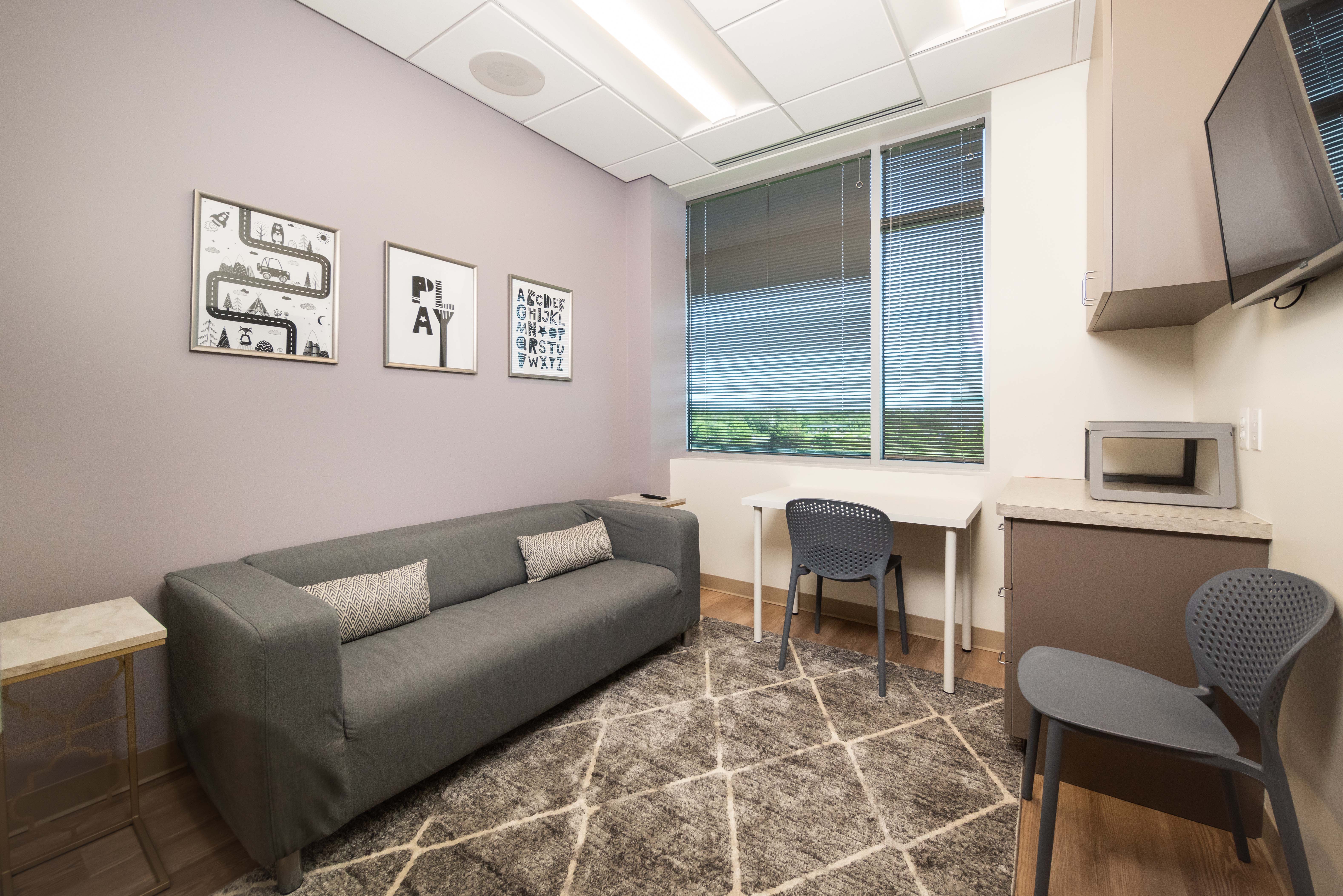
Neutral tones are the backbone of most healthcare palettes, and for good reason. They create visual calm, minimize distractions, and offer flexibility across different functions. But a space built entirely of beige and gray can easily feel sterile or bland.
The key is thoughtful contrast. Use neutrals as a foundation, then introduce subtle but purposeful color moments through accent walls, furnishings, or curated artwork. This helps define space without overwhelming it and brings warmth and personality to healthcare environments. Well-balanced palettes guide attention, support zoning, and offer just enough variation to feel comforting, without overstimulating patients or staff.
Think Holistically
Paint is just one element in a much larger visual composition. Flooring, millwork, textiles, artwork, and signage all shape how color is perceived and how cohesive a space feels. A vibrant wall might clash with patterned upholstery or compete with bolder materials nearby. Conversely, a well-placed pop of color can draw focus to a key area or create consistency across a suite of rooms. Thinking holistically ensures that each element supports the others and that color feels integrated, not incidental.
Know Your Audience
Different users experience color in various ways, and what feels calming to one group may be overwhelming to another. Older adults, for example, may have trouble distinguishing low-contrast tones and often benefit from more saturated hues. For neurodiverse individuals, cool shades, soft transitions, and low-stimulation environments are usually more supportive. Patients with vision impairments or sensory sensitivities should also be considered when selecting colors for floors, walls, and furnishings. Inclusive color choices go beyond aesthetics—they promote safety, comfort, and dignity for all users.

Use Color for Wayfinding
Effective wayfinding is important in any healthcare setting, regardless of size. Color can quietly reinforce a sense of place and direction. Differentiating departments with consistent accent colors, signaling transition points with tonal changes, or using color to distinguish public and staff zones helps orient users without relying solely on signage. When applied thoughtfully, color becomes a subtle but powerful wayfinding tool—helping patients and visitors feel more at ease and in control.
Color can do more than decorate—it can connect people to place, guide movement, and shape experience. At Interplan, we use color with intention, always grounded in the needs of the people who live, work, and heal within the spaces we design.